Confidential Government Platform Submission Experience Optimization
My Role: UX Designer
Timeframe: 4 weeks
Methods: User interviews, Support Ticket Review
Tools: Figma
Due to non-disclosure agreements, identifying details have been removed.
Summary:

Introduction:
I worked on improving the submission experience for a confidential government platform that led to a 70% reudction in support tickets.
The Problem & Objective:
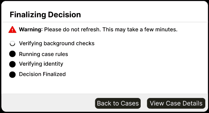
The platform supports time-sensitive government workflows where successful submission is critical. After users clicked submit, the interface displayed only a generic loading spinner with the text:
However, the interface provided:
-
No progress indication
-
No status clarification
-
No reassurance that the system was functioning
As a result:
-
Users assumed the system had frozen
-
Many refreshed the page
-
Refreshing caused process restarts or system errors
What appeared to be a technical failure was largely a perception and communication problem.
My Process:
-
Support Ticket Analysis: Reviewed the volume, language, and patterns in tickets. Users consistently described the loader as “broken,” “frozen,” or “not working” — even when the system was processing normally.
-
User Interviews Conducted 4 interviews with frequent platform users. All 4 described high anxiety during the loading state. 3 of 4 admitted to refreshing within seconds. Key insight: users wanted confirmation, not speed.
-
Competitive Analysis Examined loading patterns across similar government platforms. Found that the most trusted platforms used step-by-step status modals rather than generic spinners.
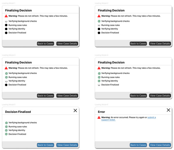
Recommendations:
Design a modal that provides explicit system status feedback and warns users not to refresh.
Solution:
I designed a loading modal that:
-
Met WCAG accessibility standards
-
Communicated that the system was actively processing
-
Provided clear reassurance messaging
-
Reduced uncertainty during wait times
-
Encouraged users to remain on the page