ArtStation Redesign
My Role: Designer & Researcher
Timeframe: 3 weeks
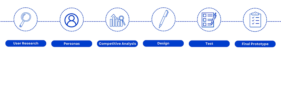
Methods: User Research, Personas, Competitive Analysis, Design, Usability Testing, Prototyping
Tools: Zoom, Figma
Introduction:
ArtStation is an app that allows users to browse and display art. ArtStation has thousands of users, yet its mobile app is not popular and receives many negative reviews for being difficult to use. I aimed to redesign ArtStation to be more user-friendly so that it can retain more users.
The Problem:
The ArtStation homepage is not only cluttered but also lacks essential features that the majority of art portfolio apps have. The app also has alignment issues that may make it seem unappealing to some users.
User Research:
I interviewed five people and asked them what they thought of the current ArtStation app.
When trying to use the app, people complained about the lack of a central upload button. There is no way to upload pictures from the main home page of the app, which is unusual for an art-sharing app. Additionally, users found that the home page looked clunky.
“A central button to post should be the bare minimum for any type of portfolio platform.”
“It is rather clunky. I would just use the website.”
“It is a pain to traverse and find what I need to.”
“I can not figure out how to send these pictures to other people.”
"I don't know how to edit my profile."
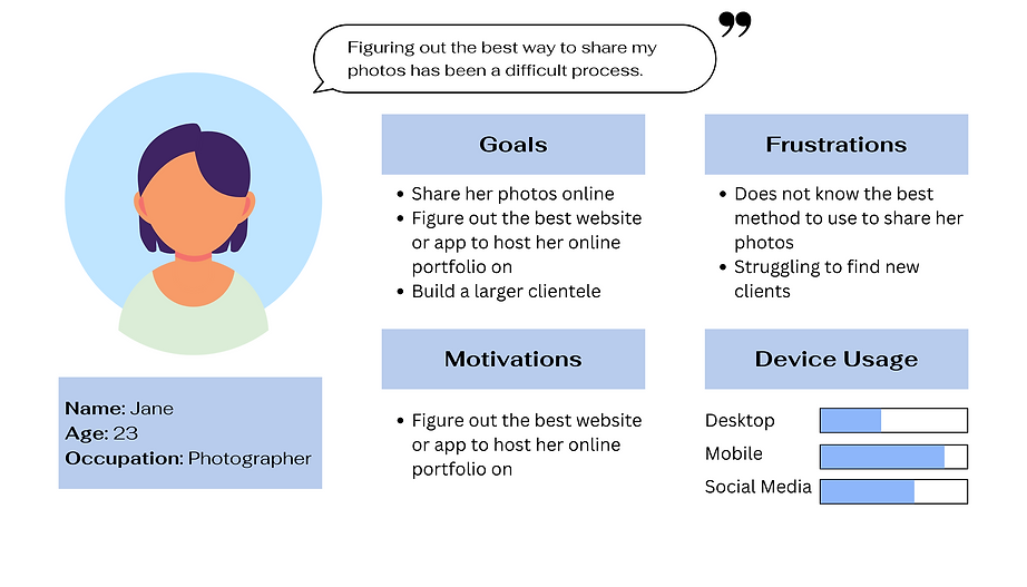
Users want the explore page to be less clunky, have an easy-to-find upload button, and better locations icons so they can easily find what they need. Additionally, users would prefer an easier way to share pictures with others. I developed a persona based on the user interviews and research I conducted.
Competitive Research:
I examined two similar apps, DevianArt and Instagram, to see how they were designed and where their upload buttons were located. Both of these apps feature a sleek design for their explore page, along with clearly labeled upload icons.
Solution:
-
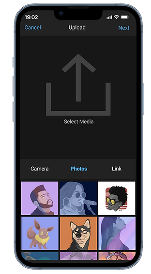
Add an upload button
-
Add a share button
-
Redesign the UI to be less clunky
-
Adjust and change icons to be more recognizable
-
Redesign the profile page and add a clearly labeled edit button
Redesign:
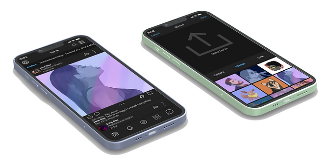
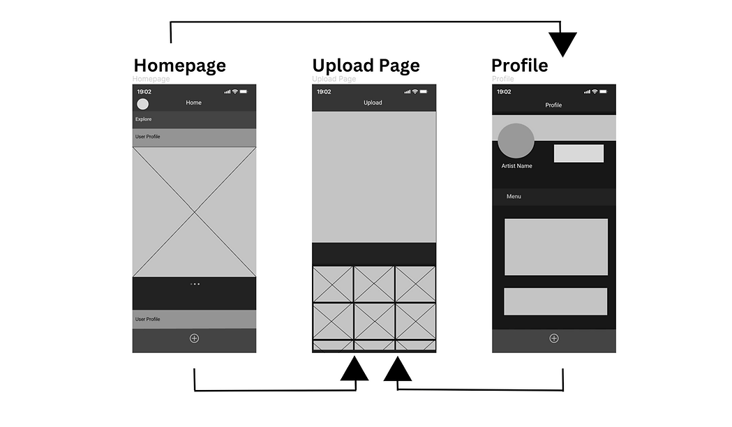
I created a simple wireframe to get a general idea of how the final app interface would look. With this design, users will see a more aesthetic design along with an easier way to upload their art.
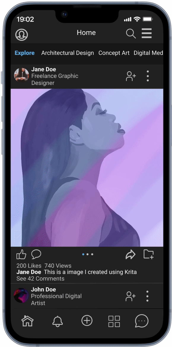
The ArtStation redesign features:
-
New icons arranged in a logical order
-
Central upload button
-
A share button
-
Simplistic, modern design
-
Redesigned profile page

Usability Testing:
I conducted a small usability test using 5 participants to see if they were now able to navigate through the ArtStation app easily. Each participant was able to navigate to the upload page in less than 30 seconds. Everyone was also able to figure out how to edit their profile easily.
"This looks great, I would use this to share my work."
"I really like how to profile section of the app looks."
"The homepage looks clean and sleek, and everything was easy to find."
Conclusion:
I was able to figure out the issues within the ArtStation app. Users should be able to navigate the home page better and be able to easily upload their artwork. Additionally, users would be able to edit their profiles quickly. With these design changes, more users would utilize the app instead of relying on the website.
You can view a prototype of the project:
Reflection
In the future, I would probably do a heuristic evaluation of the app before I begin the redesign process. I plan on continuing to redesign more pages and do a complete redesign of the ArtStation app.